athenahealth
Visit Prep
Help patients get ready for their doctor’s visits ahead of time, so their doctors can focus on them during the visit.
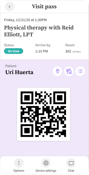
Background
Problem
When COVID-19 began in 2020, preparing for visits became harder for patients, clinicians, and staff. Check-in is when patients update health info, insurance, or medications. Our limited check-in system added extra work for everyone and because the workflow involves patients, front desk, and clinicians, improvements needed teamwork across groups. In September 2020, Consumer Health’s Check-in team redesigned the process to help patients before visits and give front-office staff and clinicians better tools to share pre-visit tasks.
Role
I led Discovery for three main work phases: the patient north star, configuration, and front‑desk visions. I partnered with embedded scrum designers, meeting 1:1 to share the north‑star strategy and guide designs during development. I also aligned clients and cross‑divisional stakeholders around the patient and front‑office north‑star vision.
Team
My product manager Nathan and I prioritized discovery, did client research, and aligned cross-divisional teams. We set the scrum roadmap and priorities with embedded designers. Because the project reworked legacy technology, I regularly met with engineering leads Brian (Architect) and Allison (Engineering Manager) to keep discovery aligned with the architecture. Jenn and Kayla led detailed design delivery.
Business impact
Two major client requests drove Check‑in, tied to about $800M in potential revenue (estimated by Voice of the Customer and DesignOps based on adoption and increased bookings). Patients wanted a faster, more flexible and personal check‑in. Clients wanted patients to self-complete registration and parts of the exam, and update health records outside visits. We aimed to ship an alpha in summer 2021 and a full GA release by summer 2022.
Process
Stakeholder sessions
We ran early alignment sessions to guide the Discovery and Definition phases for Check-in. The goal was to prioritize Discovery, Alpha, and GA work that explores patient-focused workflows to better link patient data with their record and exam.
Client interviews
In 2020, my product manager and I interviewed clients to learn changing needs for Check-in.
Takeaways
Shared waiting rooms and limited staff made traditional check-in unsafe and hard to use.
Check-in needed to become a flexible service with features adjusted by clinic setup, specialty, and appointment type.
Needs
Make Check-in content more flexible
Track patient progress and enable real-time office–patient communication
Find new ways to send clinical tasks to patients
Confirm patient payment responsibility early and follow up on payments
Add curbside and wayfinding features
Show follow-up tasks after patients finish check-in
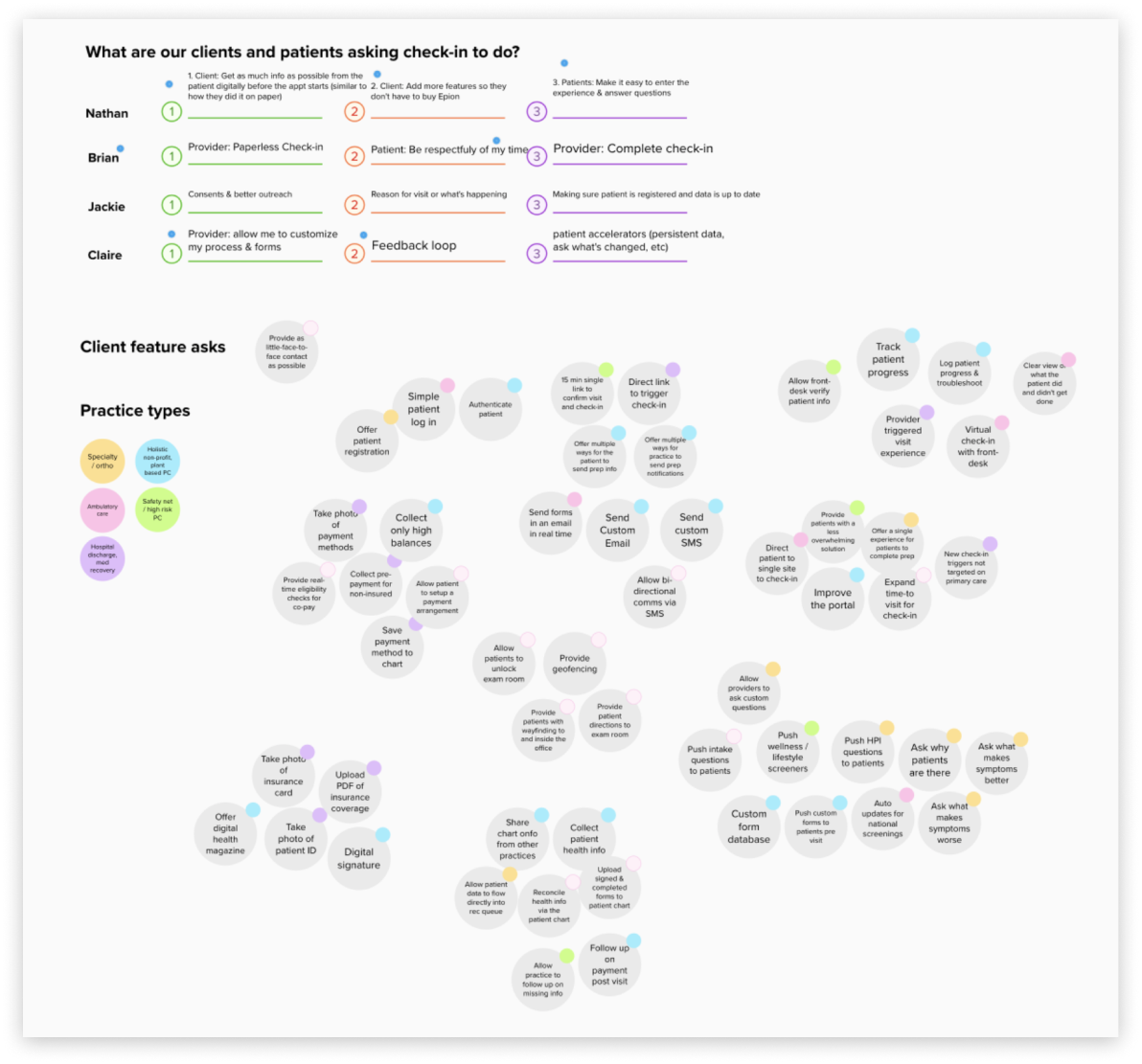
Affinity map of client requests from interview synthesis
Impact mapping
I ran this exercise to get Consumer Health leaders aligned on the top roadmap priorities and to show which capabilities still need discovery.
Process
I created an impact map to plot features by their patient benefit and our confidence in delivering them.
Axes
Impact: Will this improve patient behavior and meet client goals?
Confidence: Do we want to do it, understand it, and can we deliver it without risky dependencies?
For Discovery, I explored new patient scenarios for Check-in and added channels like curbside arrival and chat check-in.
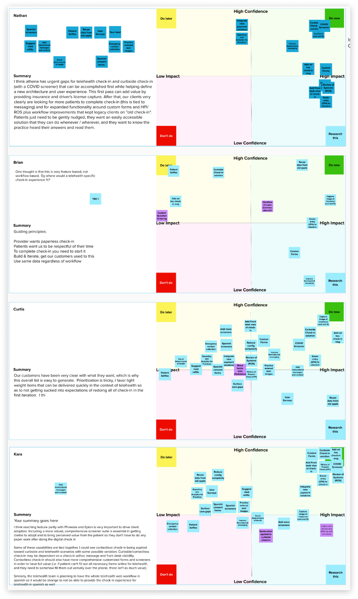
Impact mapping framework and exercise results
Cross-vertical workshops
With our client-facing team, Complex Registration, we ran a workshop to create a clear plan for onboarding patients to athena and improving their chances of a successful visit.
I named the workshop “Exquisite” after the game Exquisite Corpse to move beyond traditional design thinking and unite ideas from different design teams and user groups.
OUTCOME
This workshop defined a basic Check-in patient journey and aligned early ideas across sub‑divisions and athena users, including front desk staff and medical assistants, not just patients.
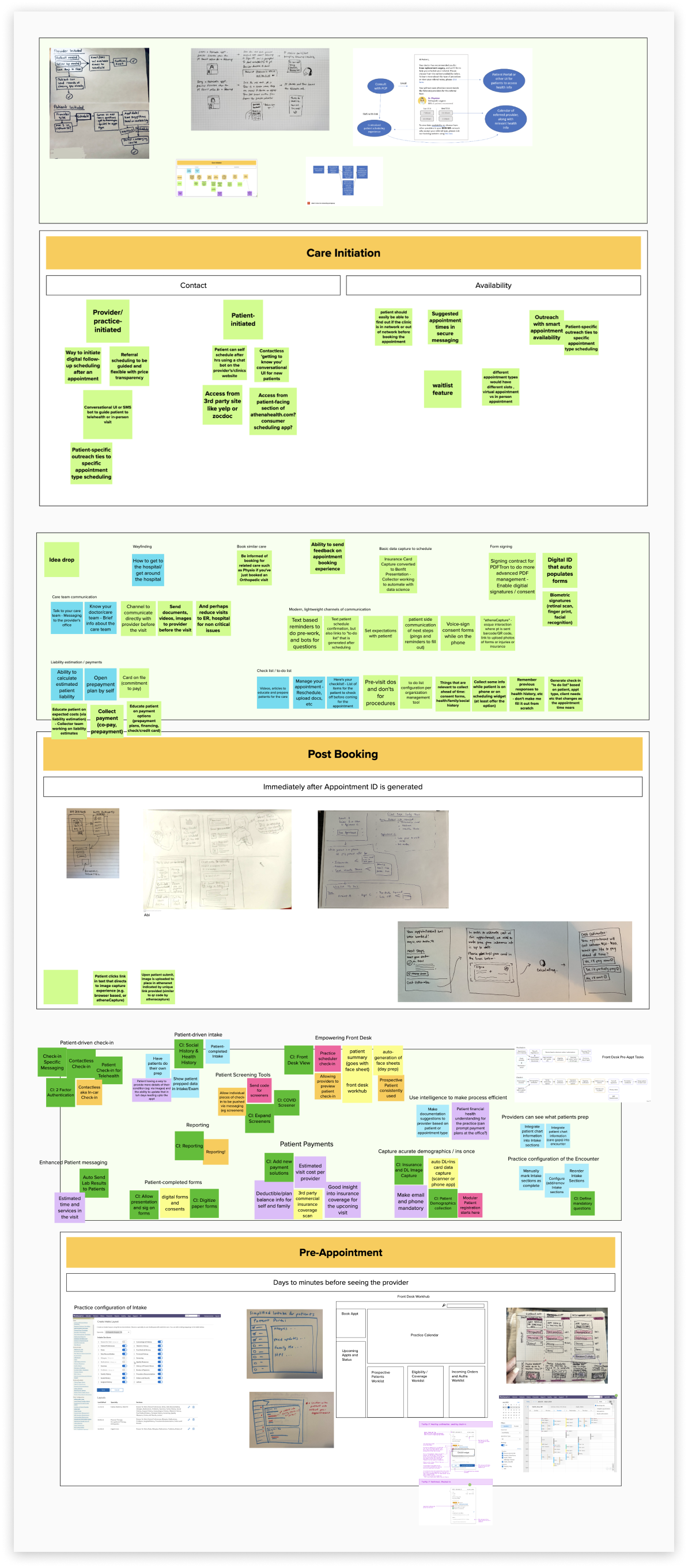
Participants were broken up in 4 core squads, each representing a different phase of onboarding and Check-in. Within their assigned phase, teams worked together to ideate on solutions and concepts that could better serve clients and patients.
Card sort workshops
I wanted the design team to agree on how Check-in content is grouped.
Process
I began by combining the most useful capabilities we identified with ideas from the onboarding workshop to define the patient-facing features needed for each visit type, such as same-day in-office visits or Telehealth calls scheduled days in advance.
Synthesis
The card sort clarified an initial content strategy for the patient experience. Most designers grouped content by clinical vs. non-clinical roles. That showed how patients prefer to see content and let me add new concepts and features, shifting the workflow to better match patient expectations.
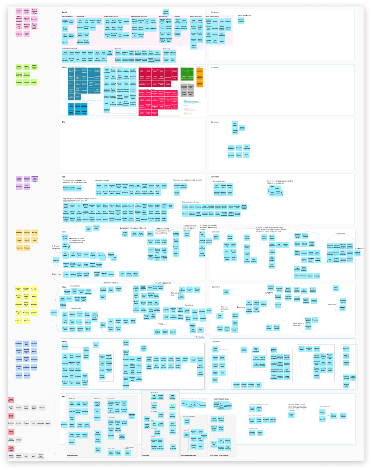
Card sort framework and exercise results
Service & systems design
I mapped how patients and staff move through the Check-in process. These maps let me build a basic timeline showing when patients can use features and when staff get updates from them.
Service digrams
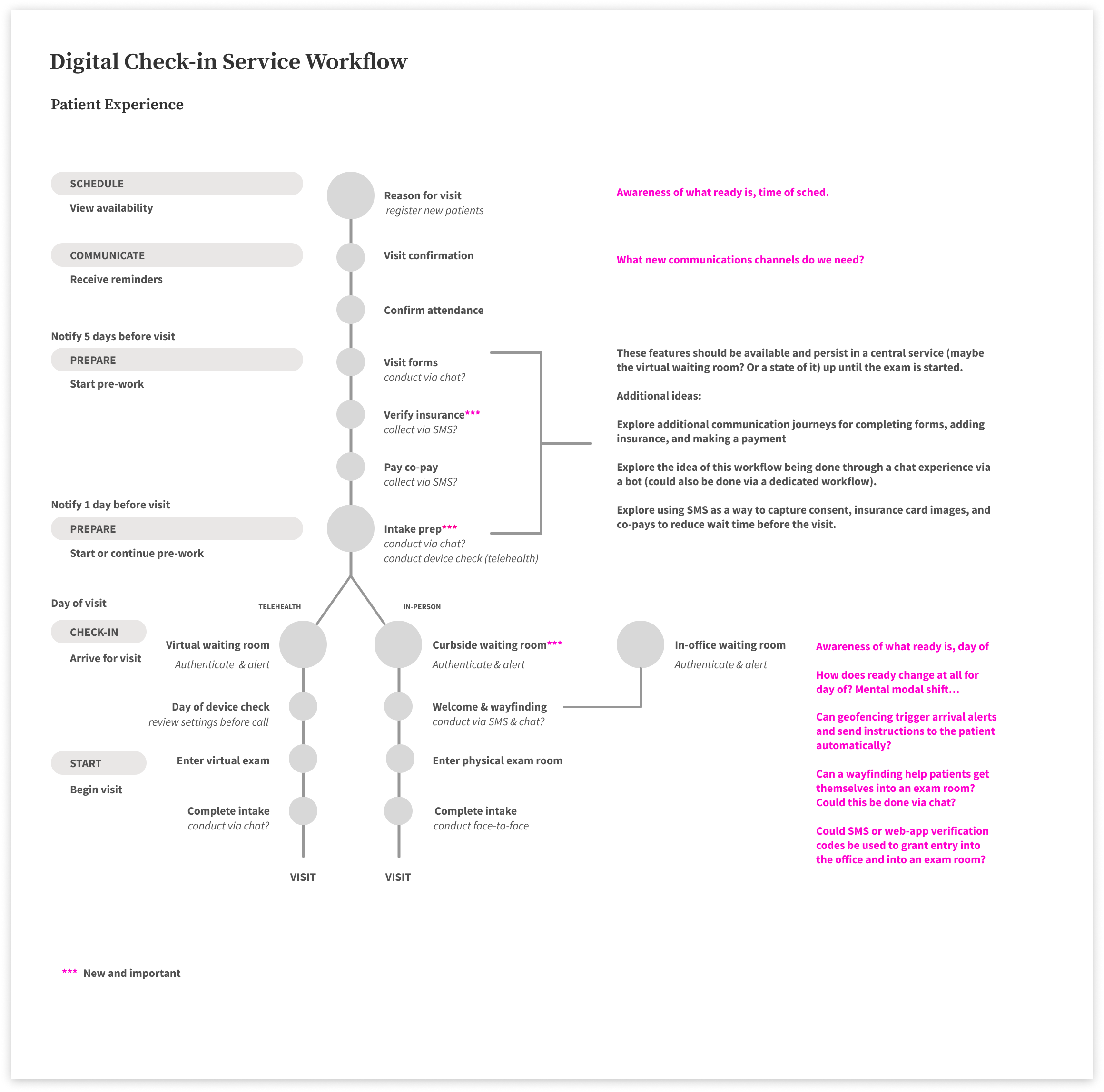
My early service maps were influence by the design language of subway maps. I wanted to look at each feature like a stop along a subway line. Larger areas are mean’t to represent a central stop where sub-workflows may branch off.
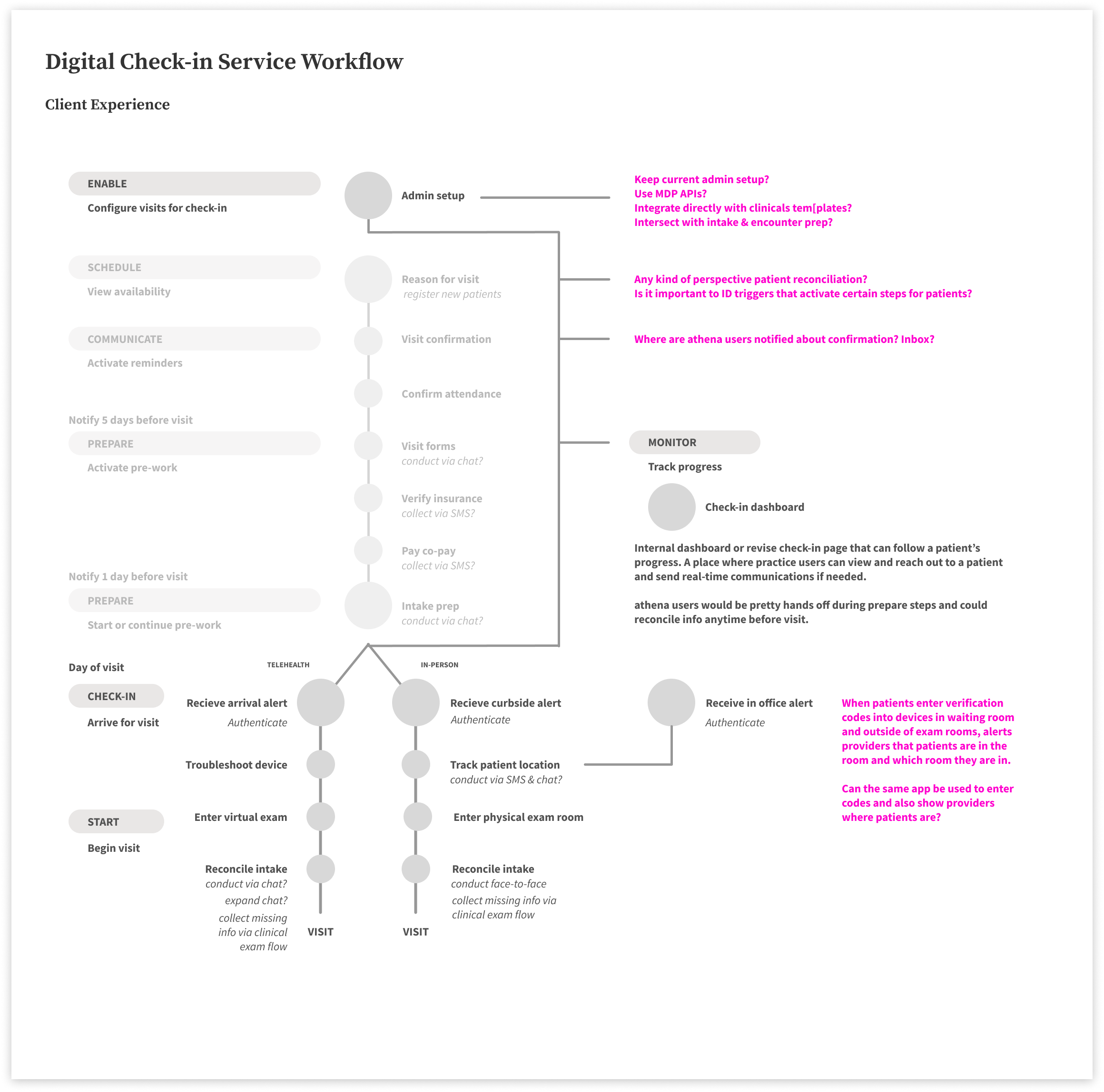
Using the same visual language, I wanted to layer on the clinical-facing experiences along side the patient’s in an effort to view all needs within a single service.
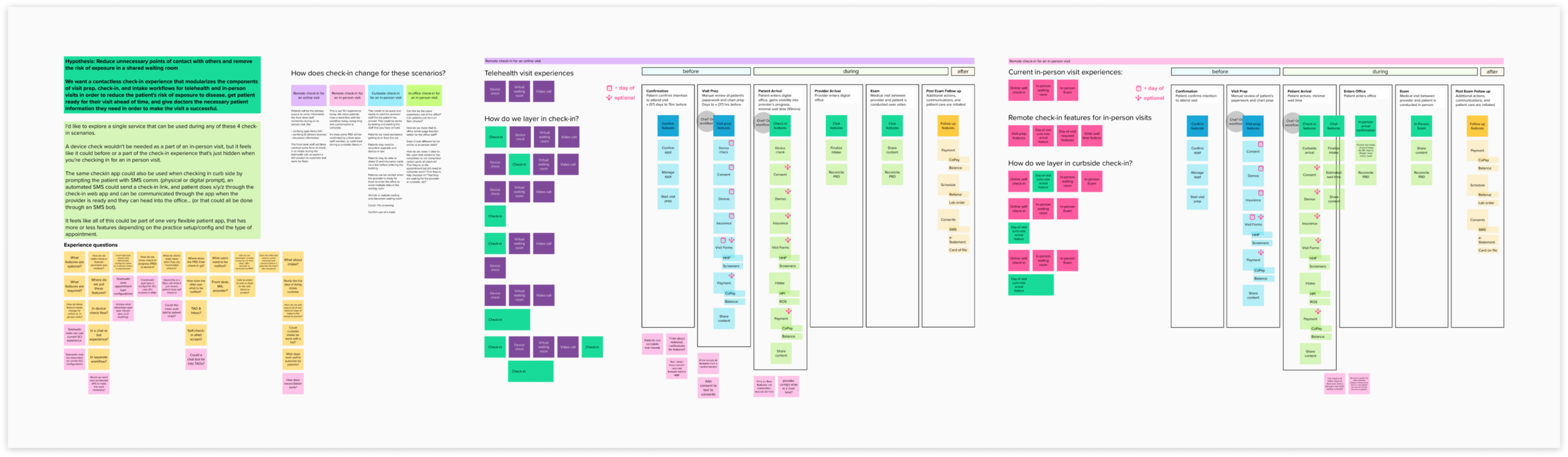
This map looked at how feature sets may change for in-person and remote visits and started to ideate on when certain features could or needed to be completed by the patient, before, day-of, or during the visit.
Micro front-end map
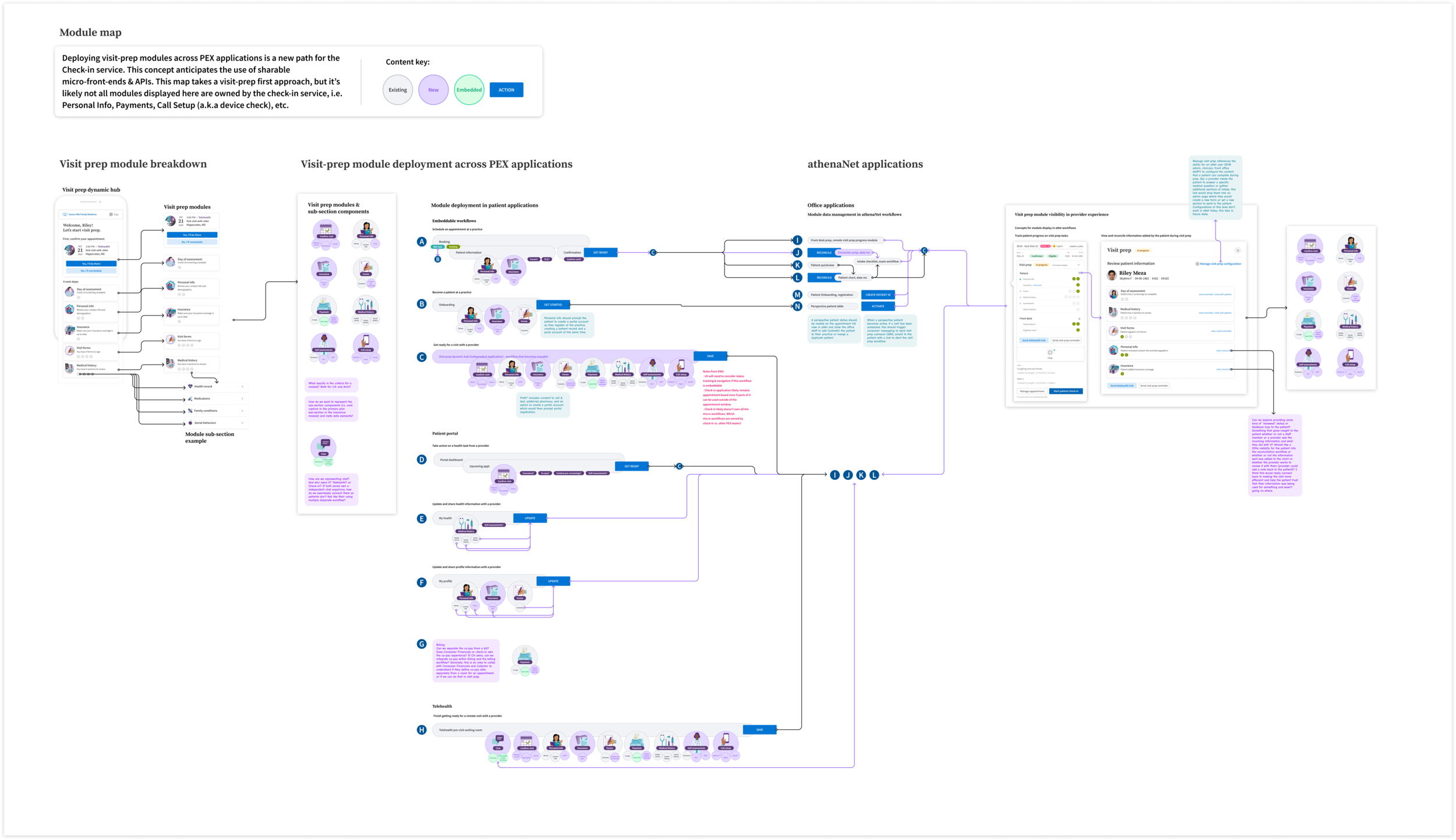
As a sub-division Patient Experience has been moving to a microservice model when developing new features. This map represents a vision for how Check-in tasks could be built modularly and deployed across many different patient-facing or client-facing applications and workflows.
North star
The Patient north star was shown as four detailed journeys that demonstrated how Check-in could vary by patient need and how features help patients prepare for visits. I mapped different ready features and workflow changes required to finish Check-in. I started with edge cases to build the four patient scenarios, letting me explore and prioritize new feature sets that hadn’t been considered for Check-in before.
Patient scenarios
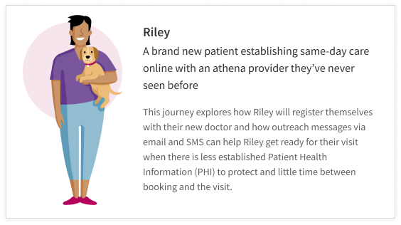
A net-new patient who is getting ready for a remote visit in a few hours
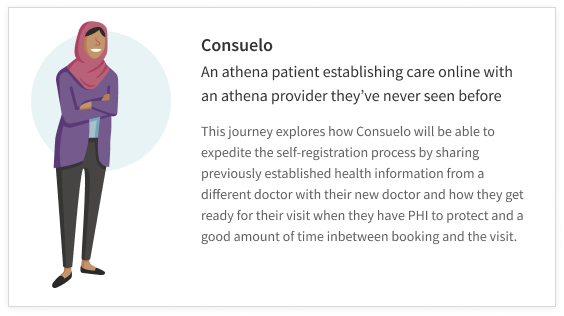
An established patient getting ready for a remote visit with a new doctor in a few days
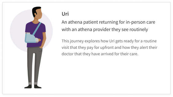
An established patient getting ready for an in-person routine follow-up visit with a specialist
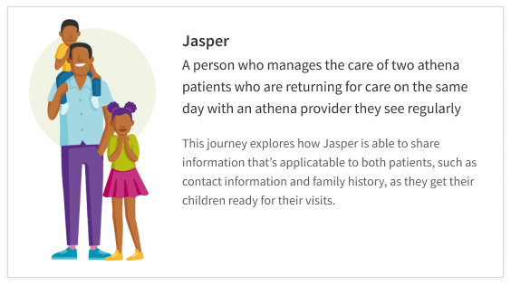
A caregiver getting multiple dependents ready for two different in-person visits on the same day
Journey narratives
For each scenario, I wrote a story of the patient’s steps from first contact through their visit. Each journey showed the team’s top features and the interactions between Patient Experience and our client-facing teams.



Key moments prototype
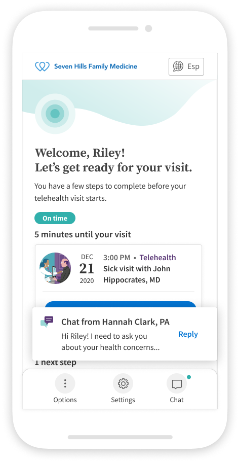
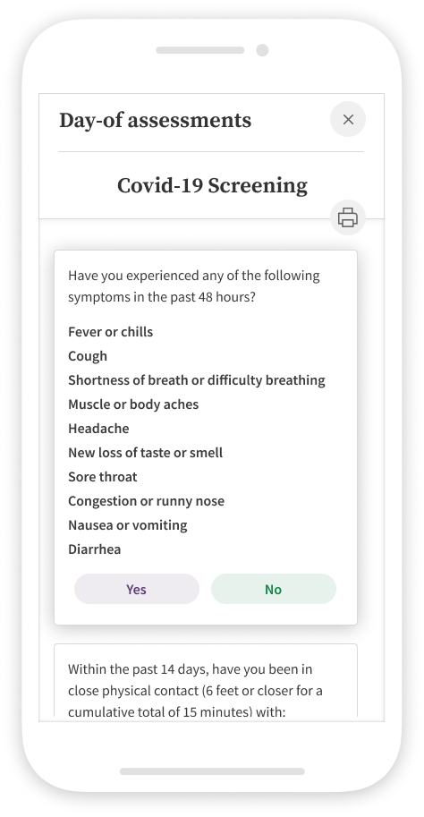
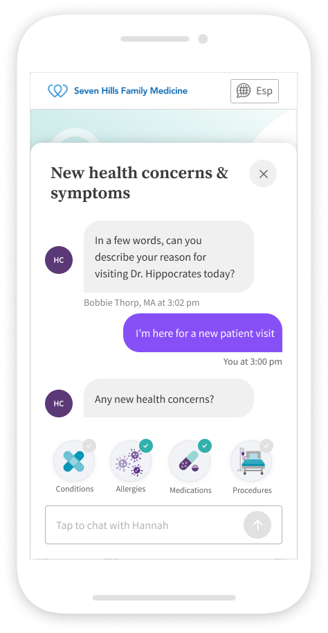
As the stories were combined, key moments emerged across user scenarios: Early Visibility, Dedicated Outreach, Authorization, Dynamic Content, and Chat. These are the design pillars of the patient check-in experience, reflecting patients' main needs and the principles behind the new features.
Checkout the Prototype to get a sense for how the key moments work together.
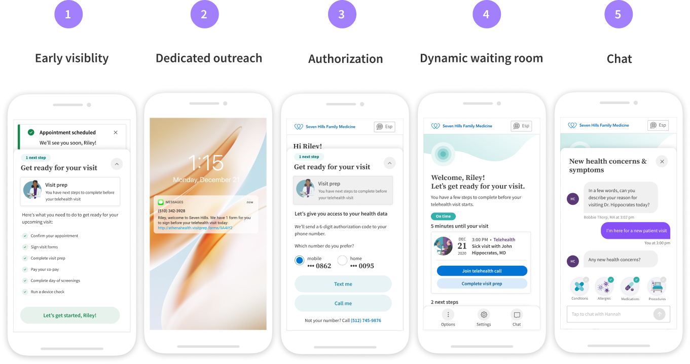
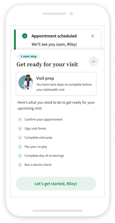
Early visibility the patient has the option to start check-in directly after booking their visit
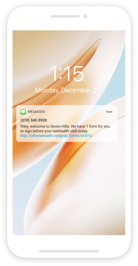
Dedicated outreach the patient receives a message with the ability to complete a specific task
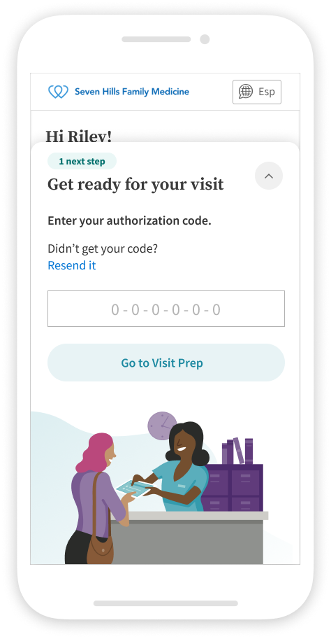
Authorization the patient needs to verify access so they can complete tasks that contains Personal Health Information (PHI)
Dynamic Waiting Room Content the patient is able to view and finish uncompleted tasks directly in the visit’s digital waiting room
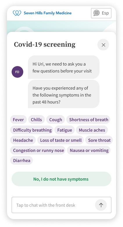
Chat the office staff can help the patient finish getting ready by completing tasks direct through chat
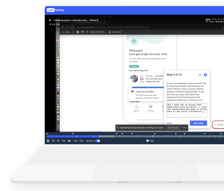
Key moment resonance testing
Confirm the Check-in chat met patients’ needs and identify when and how chat fits their expected check-in process.
Core Questions
Does chat improve the check-in process and add value?
Do patients prefer automated or live conversations to prepare for visits?
Does a particular chat type collect better information?
Findings
Tell the patient whether the chat is automated or with a real person.
Ensure clinicians see any data collected before the appointment.
Allow chat-based diagnostic workflows so patients can get care or prescriptions without scheduling when appropriate.
Use automated chat for data entry and simple questionnaires; use live chat for detailed, complex issues.
Lean UX process
Milestone plan
This project is unique because we’re doing Design Discovery and Definition at the same time. Normally Discovery comes first, but working in parallel lets us redesign a legacy workflow while making major experience changes guided by a new patient vision.
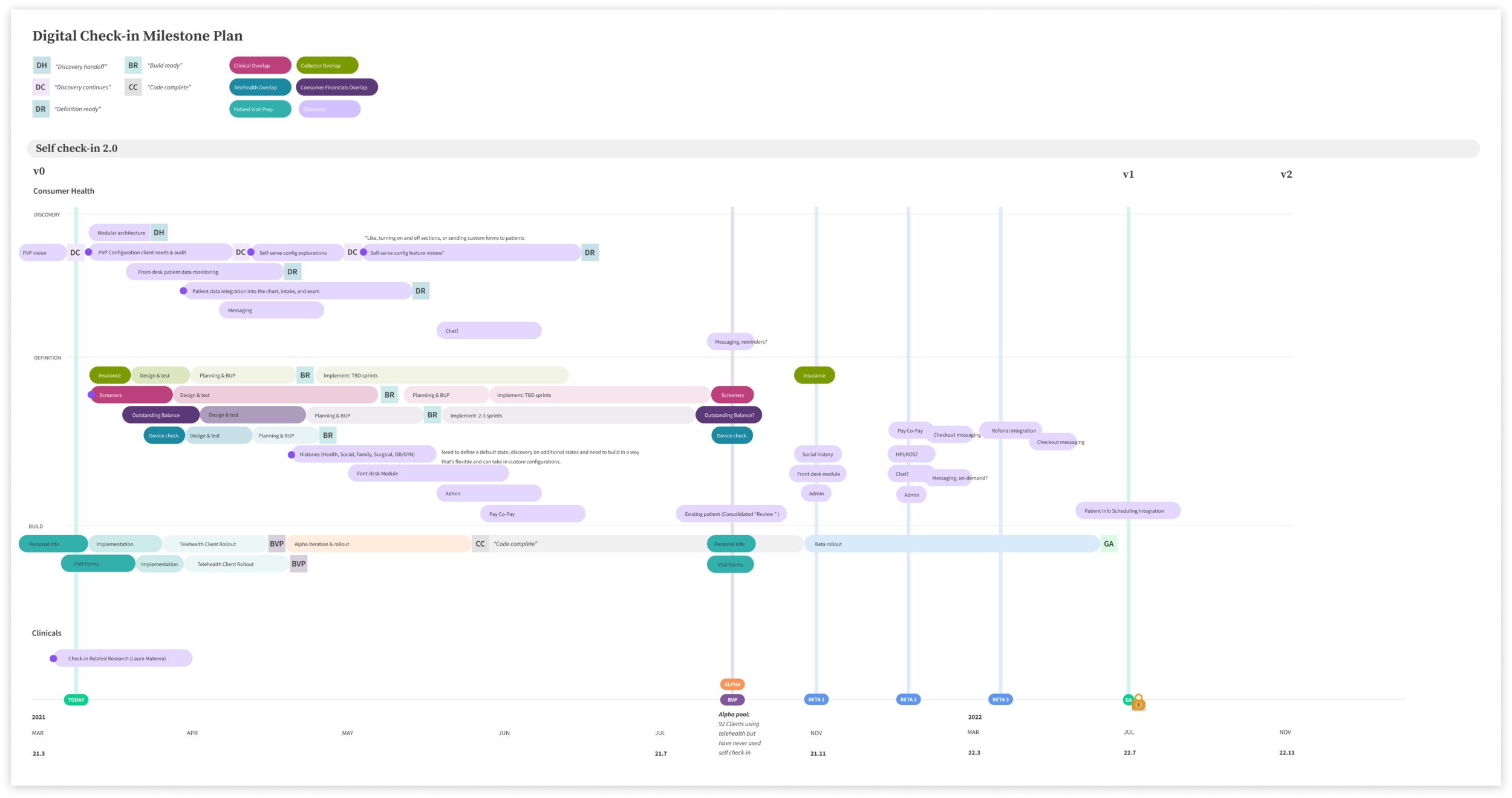
This milestone plan showcases how delivery designers and myself worked together across Discovery and Definition projects. I put this framework together with the Check-in scrum design lead Jenn in order to keep track of all the in-flight design work and release goals.
Wireframes & interaction design
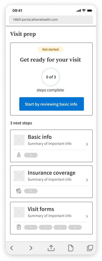
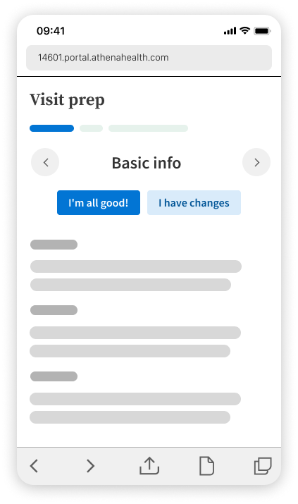
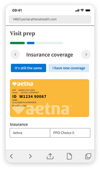
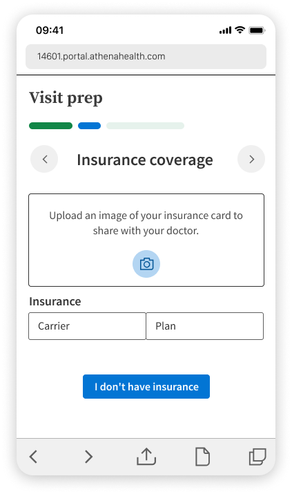
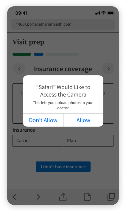
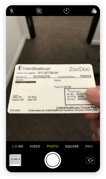
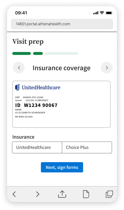
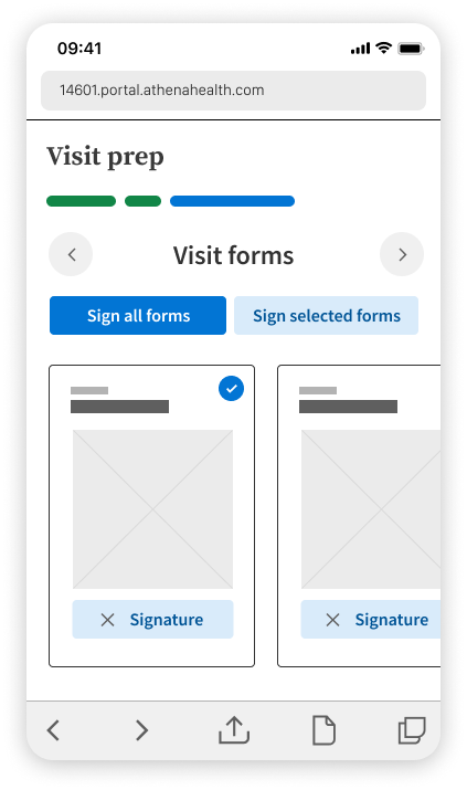
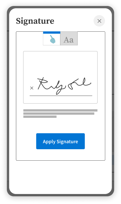
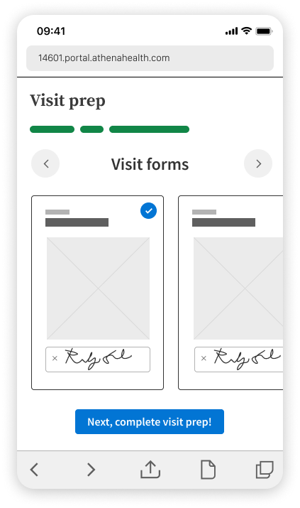
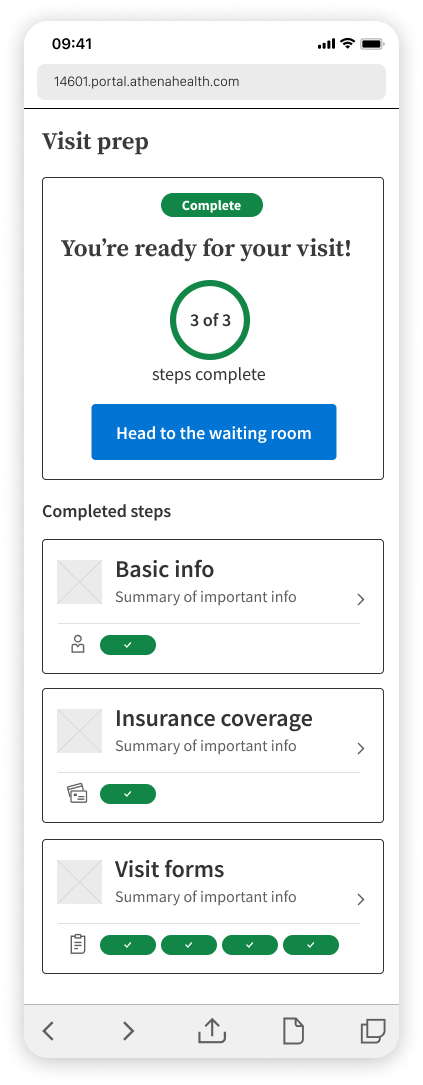
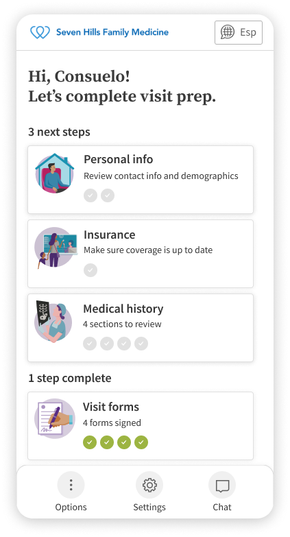
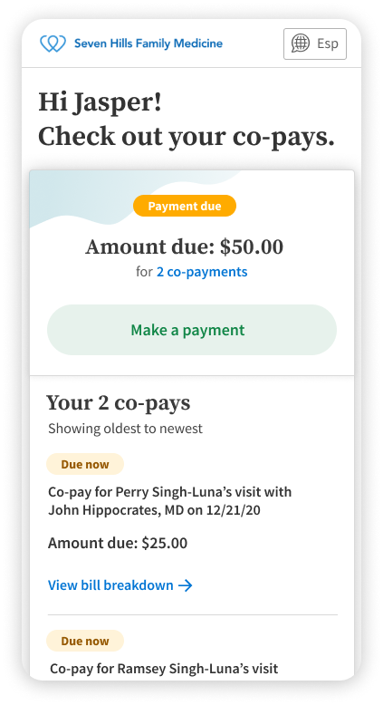
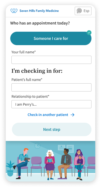
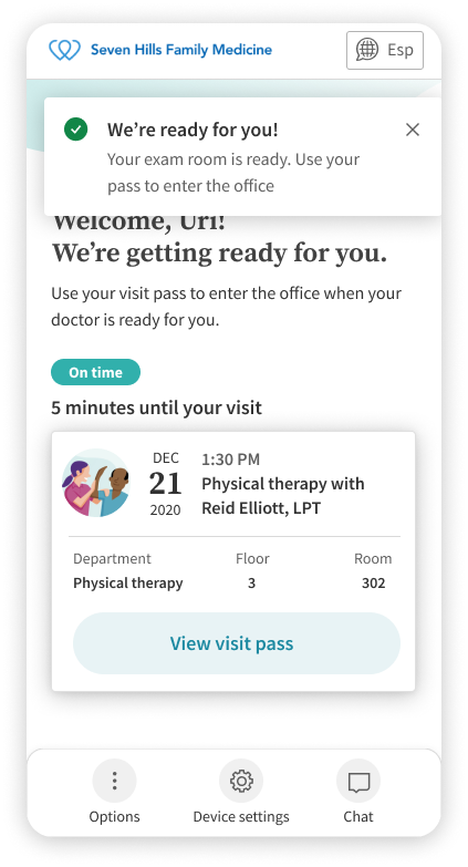
Check-in asks patients to do a lot. Clinics are shifting more of the exam tasks to patients to save provider time, but that forces patients to handle lots of information before the visit. To see how patients would manage these tasks and sub-workflows, I worked with the Check-in designers to refine navigation and interaction for the patient-facing screens. I focused on how patients encounter content at each step and how they move between steps. Because flexibility mattered, we needed a clear way to show how close a patient was to being ready for their visit. The wireframes let me test how to display progress and the completion status of each task so patients can easily see what’s done and what’s left.
View invision prototype | Password: casestudy2021